Good Read –
What can we learn from Michelangelo about good layout?
Do you know this sentiment: You are using a self-service BI tool and creating visualizations for your department, upper management or for customers. Every single visualization is meaningful. But you encounter difficulties when you try to combine them in a dashboard. It looks cluttered and confusing. You are dissatisfied with the results and so are the users.
Or have you ever encountered this scenario? You depend on daily reports and ad-hoc analyses. However, the dashboards are difficult to use, information density is low, and it takes you far too long to get the information you need.
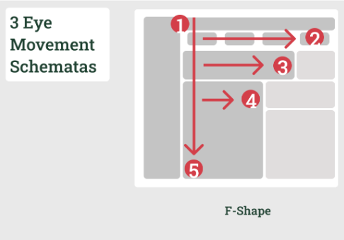
In both cases, the difficulties lie in the layout. Layout is the intentional placement of objects such as text or images on a dashboard in a way that supports the content.
Read the entire article on the blog of Woodmark Consulting AG.
I have included resources about different layout on my Tableau Public Profile.